Some notes on the design of FINARKY's price charts...
I wanted a minimalist chart (consistent with the app's design) that shows only maximally useful info and is easy to interact with (keeping in mind what Marko Ahtisaari called "better sloppy interactions" when designing for true mobility). It should make full use of the small mobile screen by displaying the chart edge to edge.
When looking at stock or crypto price charts, what actually matters is the percent change over time, not the raw price. In most apps, if stock A went from $95 to $102 and stock B from $650 to $697.89, those price points are plotted on the y-axis, leaving it up to the user to infer the key insight that both rose by 7.37% (did you notice that?). So, I decided that the price charts in FINARKY would focus on displaying price variations, not absolute prices. This also makes comparisons between different assets less misleading.
Side-by-side comparison of a price chart in the popular portfolio tracker Delta (left) and FINARKY (right):
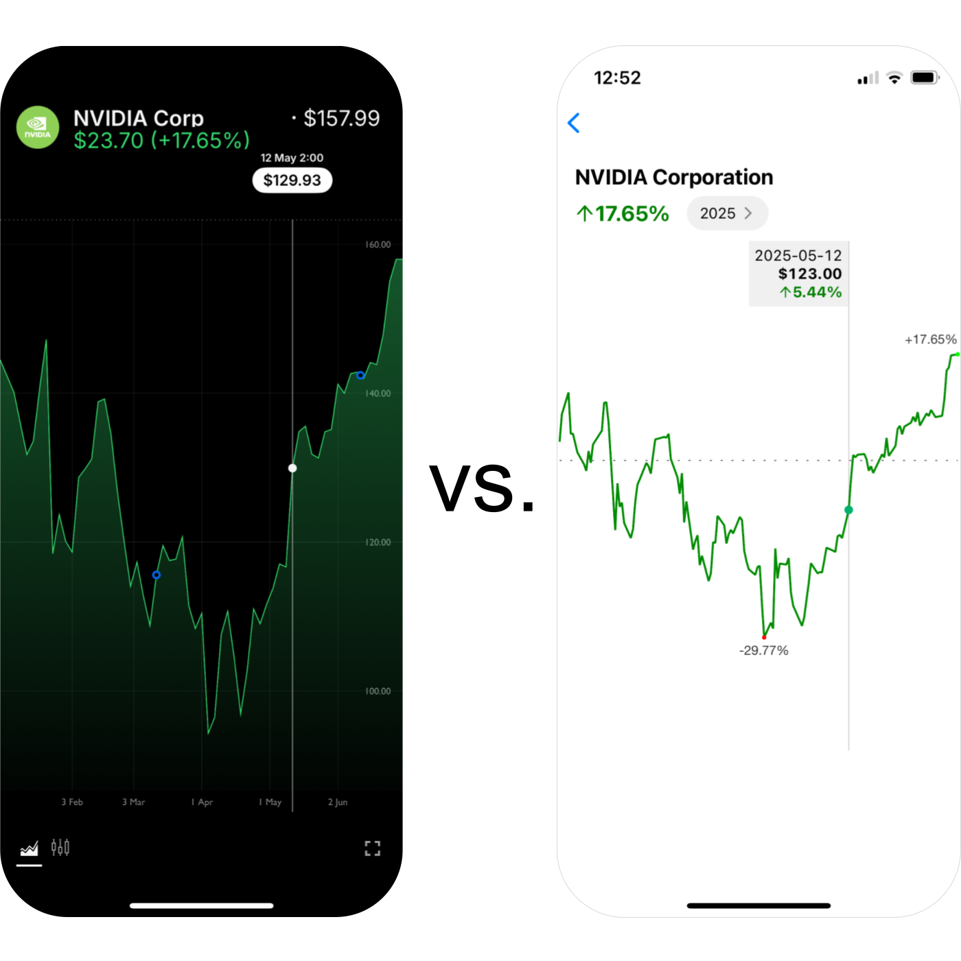
Wanting to keep a clean, minimalistic design, I considered removing the y-axis labels altogether. But then the only reference left for interpreting the chart's price variations was the total percent change shown in the screen header. With just that, it was hard to interpret the magnitude of the variations at a glance.
I was glad to find a better alternative: showing labels only for the minimum and maximum values, directly on the corresponding dots in the line chart, along with a horizontal line at y=0 as another reference. This preserves the minimalist look while making it easy to interpret the size of the variations. It also has the added benefit of directly showing the user the maximum gain and loss relative to the starting price. Moreover, the difference between them (called the high-low range or amplitude) is easy to calculate mentally and gives a quick sense of the asset's volatility.
Interactivity allows exploration of daily prices and variations by tapping or dragging on the chart. A tooltip is shown, always at the same height but without occluding the chart, displaying all the data for the selected point: date, price, and daily variation. (Again, the focus on variation instead of just price is something most other apps skip.) I've seen other price charts where the tooltip moves up and down as the highlighted value changes, sometimes partially covering the chart (Google does this). Others scatter the detailed info across different parts of the screen. I think that's quite annoying and makes it harder to skim and explore, so I made sure FINARKY avoided all that.
Also, if there's been a stock split during the selected period, an "S" pin appears on the corresponding date. Tapping it, or selecting that point while dragging, shows the split details in the tooltip (e.g., "4:1 split"). In the future, this could include other events like dividends.
If you invest in stocks traded in a different currency, exchange rates can significantly affect the price for you, as Europeans investing in U.S. stocks know well from the USD/EUR fluctuations earlier in 2025. To make it easy to see the effect of exchange rates on the price, the chart's currency can be toggled between the stock currency and your own by tapping on any price. I realize there's no visual affordance for this, but the same interaction works on the asset's main screen and is easy to remember, so I'm fine with that.
The chart may not be perfect, but overall I think it's better than any other I've seen :)
If you have any feedback, please let me know!