New in FINARKY 1.16: Charts to see your portfolio value over time
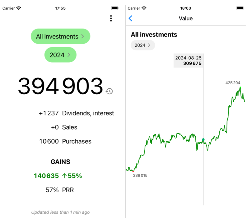
The new value charts in FINARKY 1.16 show the value of your portfolio, or individual assets, over time. The minimum and maximum values of the selected period are highlighted.
Tap the history icon next to the main value on the home or asset screen to see the chart.
Check it out!